|
|
Post by Myrddin on May 19, 2013 16:33:14 GMT 10
That looks awesome, Sky. The design looks awesome, and I love how everything is integrated.
|
|
|
|
Post by Sky on May 19, 2013 17:17:18 GMT 10
ok well, I'll get onto making a high quality version then ^^
|
|
|
|
Post by warpwind on May 20, 2013 13:38:09 GMT 10
I agree with all the above. Nice work incorporating all eleven elements. I honestly didn't think it would be possible.
|
|
Deleted
Deleted Member
Posts: 0
|
Post by Deleted on May 21, 2013 15:06:31 GMT 10
Yay I'm a dragon!! Now I can get it!!  It looks awesome, Sky! |
|
|
|
Post by Sky on May 21, 2013 15:16:56 GMT 10
Haha thanks, I only threw it together, didn't think it would go down so well  Oh and gratz shadow!  So whilst I'm working on making the logo official we need to think about its application. Initially I was thinking (summarized from all the comments and ideas you all gave me) that the symbol be available to all as simply a brand/tattoo on the dragons, it would simply be available as a basic black tattoo design. Depending on how successful I am I game with my skin sales etc I might look into funding these myself, giving them out for free to those who request it. This marking would be an accent. For dragon rank I was thinking of having the symbol set In the center of a 'band' of other elemental symbols that are etched into the dragons scales and that glow the colour of each flights element, this idea could use some elaboration so feel free to express some ideas on this idea as its a bit loose ended. This would be an accent. The final idea is that of a full skin. I was considering making the skin available on one or two breeds only but have them very detailed. My idea is that the skin would be a bit of a cross between my elemental rift skins - each dragon would have an armor-ish skin akin to its element with rifts of elemental energies coursing between the plates - and the dragon rank accent mentioned above - the symbol etched deep into the armor-ish skin where the rifts connect to. The elemental rifts would be colored to suit the element of the dragon. The only big difference between this skin and the elemental rift skin I made previously is the aror-ish plates upon its body, these will be slightly elementals sez also. I'm thinking a deep purple glass like plates for arcane, ice and earth are easy to imagine, light, water, air and shadow would be like another type of glassy scale with intricate coloring, lightening a dark metallic scale, plague bone like plates and the fire would resemble magma with the glowing rifts beneath. I think the guardian would be best suited for this as they are an easy breed and have the right structure for the design. I MAY consider other breeds but that will be a loooong way off. Let me know your thoughts!! |
|
|
|
Post by Sky on May 21, 2013 22:58:38 GMT 10
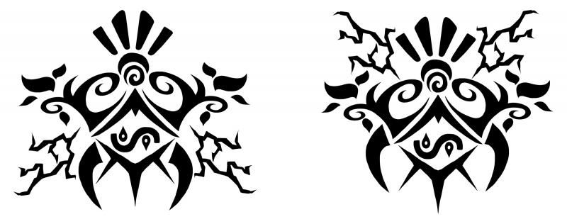
Hahaha Thanks Eli ^^ *cuddles* The wing idea is great!! Well, I had a few more plays around with the design whilst creating a more clean version and though most ideas were scrapped in favor of the original there was an additional idea that I wanted to present. Please vote on which version you prefer, left or right. Once I have a general consensus I'll be going in and vectorizing the design making it very high quality and easily adaptable to other applications. Dont forget to read the above comment though people, any ideas on the accent/skin applications is appreciated ^^ Thanks, Sky  |
|
|
|
Post by Sky on May 21, 2013 23:00:23 GMT 10
hmmmmm Im thinking right y'know....
XD Answered my own post lmao
|
|
|
|
Post by warpwind on May 21, 2013 23:26:56 GMT 10
Right feels more balanced to me but both are great.
|
|
Deleted
Deleted Member
Posts: 0
|
Post by Deleted on May 22, 2013 1:15:46 GMT 10
Left looks a lot more balanced to me.
|
|
Frost
Fledgling
  I am Iceborn
Posts: 49 
|
Post by Frost on May 22, 2013 6:00:51 GMT 10
I like left, right has too much going on at the top.
|
|
|
|
Post by The Opal Lady on May 22, 2013 7:43:39 GMT 10
The right is exceedingly top heavy, but the lightning bolts on the left just... don't look... like they 'fit', I suppose.
Honestly it's pretty much the lightning bolts that throws me off the design >A<; Sorry lightning flight!
|
|
Frost
Fledgling
  I am Iceborn
Posts: 49 
|
Post by Frost on May 22, 2013 10:12:53 GMT 10
Yea, drop the bolts from the left and it would be perfect c:
Or maybe put the arcane bits in the same position as they are in the right one and move the bolts down a bit?
|
|
|
|
Post by Duchess of the Snow on May 22, 2013 10:18:26 GMT 10
I prefer the right
|
|
|
|
Post by Myrddin on May 22, 2013 14:00:26 GMT 10
I like the right the best. It is top heavy, but to me it almost has a triangular shape, which I find appealing.
|
|
|
|
Post by slvrstarr (jarlis) on May 30, 2013 5:20:58 GMT 10
Just found this thread. What a wonderful idea Sky, thanks for the offer to create a design for FRF. Both of the designs look great, if I has to pick one of them I'd go with the left. Of the 2 it just looks a little better balanced to me.
|
|